Box plots
A box plot is a standard way of displaying information about the distribution of a continuous data variable based on five data summary. The five data summary consists of: minimum, first quartile, median (second quartile), third quartile and maximum number summaries.
Box plots might be constructed in different manners by different authors. The common characteristics for all types of box-plots is the box.
Which means that in all cases the bottom margin of the box lies on first quartile, the top margin of the box lies on third quartile and the line inside the box lies on median values.
The extensions which comes from the box might differ and rapaio system implements the version which it's usually named: Tuckey's box plot. What is specific to this box plot is that the whiskers lies at the datum still within 1.5 IQR (Interquartile range).
Any other points above or below whiskers are outliers. Outliers are of two different types:
- extreme outliers - outliers which are at a distance greater or equal than 3*IQR
- outliers - outliers which are at a distance greater or equal than 1.5*IQR
Example 1
Scope: Draw one box plot for each numerical variable from iris data set. We want each box plot to have a different color and we want some de-saturated colors.
Solution:
WS.draw(boxPlot(iris.mapVars("0~3"), color(1, 2, 3, 4), alpha(0.5f)))
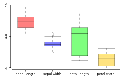
iris.mapVars("0~3")- obtain a data set fromirisdata set, by keeping only the first 4 variables. We do that using the range notation (index of the start variable, concatenation symbol~, index of the last variable inclusive). Pay attention that variable indexes are 0 based.color(1, 2, 3, 4)- we use colors from the current color palette, indexed with the specified integer values.alpha(0.3f)- we de-saturate the drawing keeping only 0.3 of the actual color.
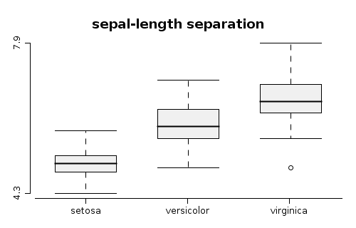
Example 2
Scope: In order to identify the overlap between values of sepal-length variable from iris data set, we draw one box plot for each segment of the nominal class variable, and add a title
Solution:
WS.draw(boxPlot(iris.getVar("sepal-length"), iris.getVar("class"))
    .title("sepal-length separation"));
iris.var("sepal-length")- is the variable namedsepal-lengthfromiris- data set, which is the numerical variable to be segmented and later box-plottediris.var("class")- specifies the segment discriminator, depending on the levels of this variable, the same number of levels will be created.title("..")- adds a title to the box plot